
Gavin had been waiting long time (even before the wedding) for a logo redesign and finally, this week and last, I put some time into doing it.

We talked about what he wanted- something that represented his photography: bold, urban, energetic and youthful. And then we discussed the crown. I had been working on the typeface for awhile so this week I was focused on designing the crown.
![]()
After I worked out a design that had the right characteristics, I wanted to silkscreen it so that I could add an additional authenticity to it and also lean into the urban, gritty quality of it.
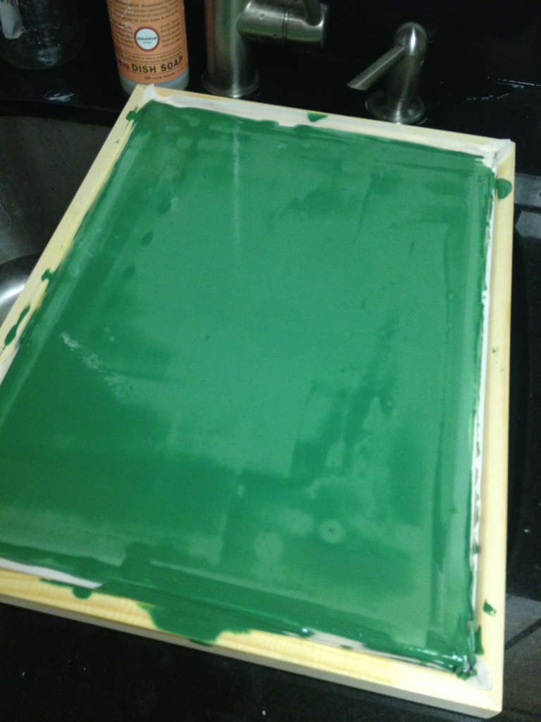
So I printed the logo onto clear acetate and then started prepping the screen (e.g., adding emulsion, letting it dry, burning the screen using one of Gavin’s super powerful photography lights.)
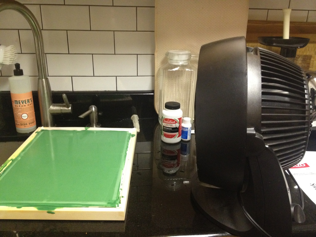
But got a little aggressive with the rinsing once the screen was burned. Instead of spraying the area with water, I started scrubbing it and lost the image. (It’s been awhile since art school- about a decade.)
So I’m going to have to do this one again. But Gavin has the logo (I even added it to his website.) that he can use so all is good on that front.


Awesome!